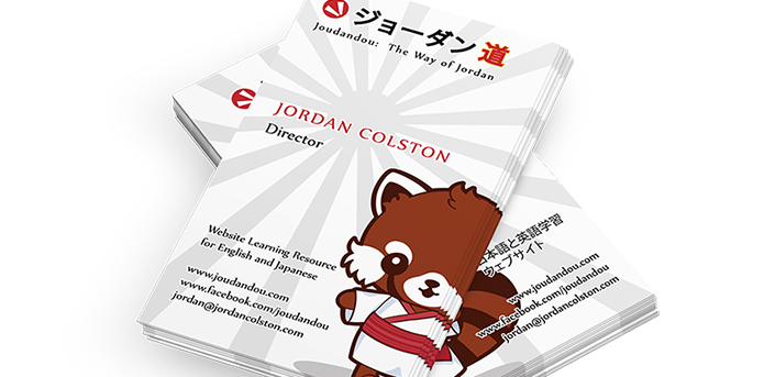
One of the many commissions I did in the past few months was to create a branding package for Joudandou.com. Included in the package was also a business card design in Japanese on one side, and in English on the other. The website is about the Japanese culture and language so for the logo I decided on a red dot taken from the Japanese flag with rectangular shapes in the middle to symbolize chopsticks or the “equal” sign. The equal sign could represent translation such as:
“kawaii” in Japanese = “cute” in English.
The red panda character, whose name is “Yamato”, will be the website’s mascot and I have already done two other illustrations for Joudandou with him in it.
Here’s what Jordan from Joudandou.com had to say about the commission:
“I’m super impressed with my new logo and business card and in the timely matter in which it was delivered. My business now has the proper flash to it to make it look professional and hopefully make a splash in the online world.” – Jordan Colston, www.joudandou.com
You can view my work for Joudandou in my portfolio here.
If you’re interested in affordable commissions for kawaii characters, mascots, logos, business cards or banners send me an email at contact@sugaroverkill.com and I’ll get back to you as soon as I can.


